And it's official: I still hate it. So did everyone else in our party. Previous comments on the architecture of the Crystal still hold, only even more so. The damn thing looms angrily over the sidewalk. The corrugated exterior siding is just ugly: stand it all up straight and square, and it would be right at home in any suburban industrial park. Skewing the walls at funny angles doesn't magically make it clever: it just makes it look like a suburban industrial building that's falling down. Inside, the walls lean at crazy angles and cock-eyed pillars shoot through the space.
I toured the paleo galleries again, and got even more annoyed. There is a serious lack of interpretive material to tell the viewer what they're looking at and why it matters. In one display case is a series of Jurassic fossil insects, each one accompanied by a similar modern bug skewered on a pin. They're all nicely identified, but so what? What exactly is this display telling me? Is it about relationships among ancient and modern insects? About insect taphonomy? Or should I take from it the creationist lesson that grasshoppers are still grasshoppers, and they all got buried in the Flood? I have no idea. And across from that there's another case in which dead bugs ancient and modern are jumbled together with no order, identification or explanation at all. And no, the video displays don't replace decent placards: only one party can use them at a time, and I don't see why I should wait in line to see if the TV has the answer to whatever question I have. And speaking of placards: would it be too hard to add a little graphic to each one, showing a schematic of the geological timescale, and a marker saying "this critter comes from here"? That would beat just saying "Jurassic", for those who don't already know that it comes between the Triassic and the Cretaceous (geek that I am, I've known since I was about 8yo -- but my FIL pointed out that he didn't). There's no obvious "path" guiding you through the exhibits, and the overall impression is less of a museum gallery than of a storage room. And how much money did these copper-clad monoliths cost, that might have been spent instead on the displays?
 But enough kvetching already. It is, at any rate, still a museum full of neat stuff.
That's one mean sardine:

Hey, he's chomping an ammonite! Bad mososaur! Bad!
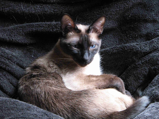
 Poor Bruin here looks a bit disconsolate about all these new-fangled changes to his abode:
 This camel on the other hand, just looks smug:


2 comments:
Hi EK,
As you may recall, I also toured the ROM when I was down for PZ Myers' CFI talk. I spent the day Friday at the ROM before heading over to Prof. Moran's private get-together with PZ.
I agree with your observations and criticisms, and would add a few myself.
I found the lack of adequate directions and signage frustrating and annoying, particularly when I only had about 5 hours to devote to the museum. The handout map was way too general and what few static maps that did exist didn't provide enough detail. And as you said, there was no clear path through the exhibits - I got the impression this was just a fancy warehouse for miscellaneous and sundry artifacts that have come their way. It had sort of that chic, sparse "art gallery" feel to it, although at least an art gallery adequately lights its exhibits!
The other thing that really irked me was the lack of water fountains. If I missed a water fountain, it wasn't for lack of looking, and reinforces my point about the abysmal signage. I doubt that I would have been allowed to openly carry a water bottle around with me, and that meant that my only recourse was to travel down to the basement (again, not adequately marked) to the cafeteria and pay for bottled water. Grrr.
Speaking of the cafeteria, I guess I shouldn't be too surprised that I found it disappointing and way over-priced. Captive audience and all that. IIRC, I paid $15 for a poorly-grilled chicken breast, way over-done roast potatoes, a 'salad' made of nothing but salad greens and a puny bottle of OJ.
On the up-side, attendance at the museum was so sparse that I had long stretches of time where I was the only person in the area. I got so used to the peace and quiet that, when I felt annoyance at being disturbed by the occasional tour noisily flying through, I had to remind myself that those people had paid to see the exhibits too and I, with my quiet, slow contemplation of each individual exhibit, was evidently the exception.
Overall, quite a disappointment. Definitely not worth the $22 admission, not by a long-shot. I hope this isn't a trend in museum design!
βPer
I found that Ideas program I was talking about - the one about museums.
http://www.aam-us.org/pubs/mn/mindfulmuseum.cfm
It seems to me that the ROM has become a poor implementation of the "museum as mausoleum".
It annoys me though that he makes the mistake of equating the architecture with what's happening inside: "Perhaps we want the museum as a metaphor for our larger life, and that’s why we turn to museums that are extravagant, romantic and rococo, like Frank Gehry’s Guggenheim in Bilbao, or the new “crystalline” addition to the Royal Ontario Museum." The outside may look "extravagant, romantic and rococo" (or ugly and pointless, if you ask me), but the museum experience (mausoleum/machine/metaphor/mall) is totally unrelated to the shape of the building or the greebling.
Post a Comment